In competitive Kings of War, we often talk about “hammers” (high-damage units) and “anvils” (resilient units), but how concentrated is this power within our armies? A list with all its hitting power in one unit might be easier to shut down with chaff than a list that spreads its damage potential across multiple units. Today, I’m introducing a new addition to my pre-tournament analysis toolkit that helps visualize and quantify this aspect of list building.
The Power Analysis Dashboard
The new Power Analysis sheet tracks two key metrics for each army list:
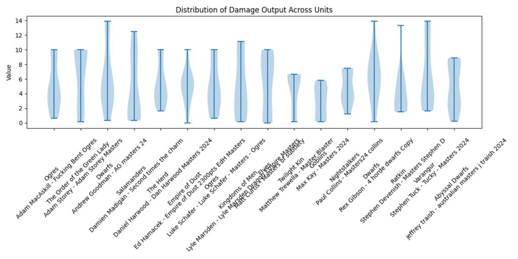
- Damage Output Distribution: How concentrated is the army’s killing power?
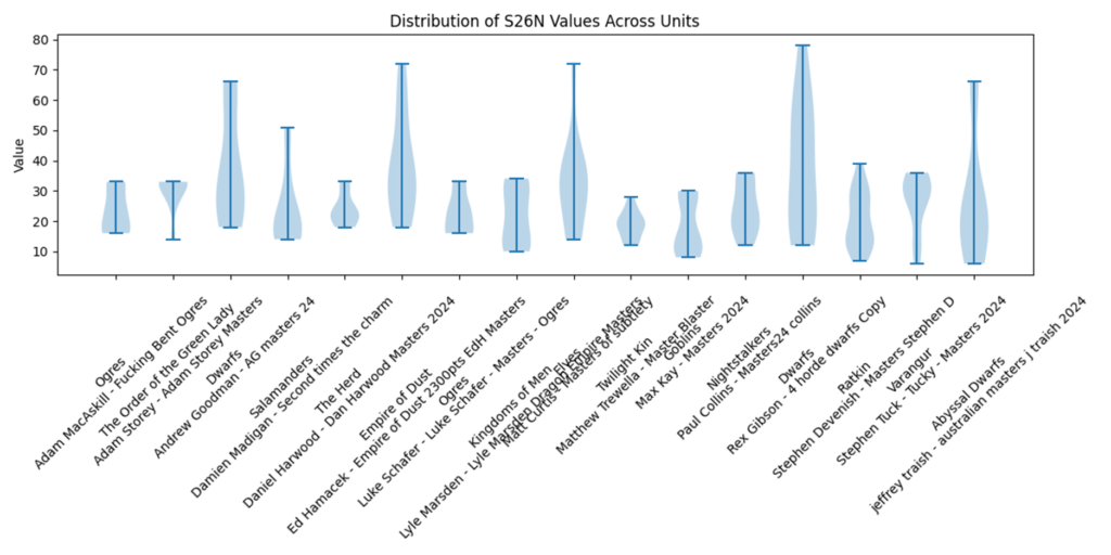
- Resilience Distribution (S26N): How evenly spread is the army’s staying power?
What is S26N?
S26N (Shots to Six Nerve) represents how many average hits a unit can take before reaching a nerve value of 6 – the point where even mediocre nerve checks become dangerous. This metric combines both Defense and Nerve characteristics to measure overall resilience. Higher values indicate tougher units.
Top Unit Analysis
For each army list, I identify:
- Top 3 damage dealers with their expected damage output
- Top 3 resilient units with their S26N values
This helps quickly identify the key pieces in each list and compare them across armies. For example, an army might have a single hammer unit with expected damage of 12.5 while another spreads its damage across three units each doing 6-7 damage.
Distribution Statistics
We then look at the spread of these values across the entire army:
- Mean and median values show the typical unit’s characteristics
- Standard deviation helps quantify how “spikey” the list is
- Violin plots visualize the full distribution of values
What Can This Tell Us?
Identifying List Archetypes
- Top-Heavy Lists: High standard deviation, big gap between top units and median
- Balanced Lists: Lower standard deviation, closer mean/median values
- Specialist Lists: Distinct clusters in the violin plots showing dedicated roles
Strategic Implications
- Chaff Vulnerability: Lists with highly concentrated damage output might struggle if their key hammer gets tied up
- Redundancy: Spread-out damage provides backup plans but might lack killing power against tough targets
- Target Priority: Understanding an opponent’s power concentration helps prioritize what to protect and what to shut down
Example Analysis: 2024 Australian Masters
Let’s take a quick look at the 2024 Australian Masters as an example. I had my original writeup here. The new analysis adds one more tab:
That tab includes information about the variance across the list in damage and resiliency:


For example, you can see from the damage variance that Matthew Trewella’s Goblins are in a pretty narrow range of output (where losing one unit, either to rout or chaffing, is unlikely to have a big impact), while Adam Storey’s Green Lady list has a wide spread with an emphasis on top units–so losing one or two units early could be devastating.
Integration with Existing Metrics
This new analysis complements our existing metrics like:
- Overall Expected Damage
- Average Defense
- Unit Type Distribution
By understanding not just the total values but their distribution, we get a more complete picture of how an army will perform on the table.
Looking Ahead
I’ll be tracking these distributions across tournaments to identify successful patterns and how they vary by faction. Are some factions naturally more concentrated in their power distribution? Do winning lists tend toward certain distribution patterns? Is this analysis worth digging into, or do you have other ideas on factors I should be tracking? I’m always open to ideas on how we can make this more useful!

